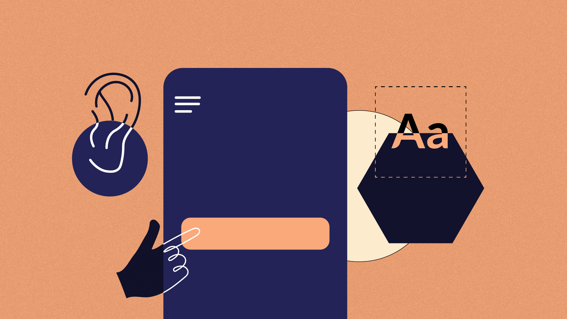

Accessibility, in its simplest sense, is the practice of designing and building products or services that can be used by everyone, including people with visual, auditory, or motor disabilities. Accessible designs provide a rich and better experience for all who use it.
The other day, I tried opening a can that didn’t have the metal ring pull on top of it...and I also couldn’t find my can opener. I spent the longest time trying to pry it open with a knife, while also taking extra precaution not to hurt myself.
Think of the simplest things you use as you go on with your day; from push to open buttons, to curbed ramps and even TV series subtitles….these designs all provide a richer experience for people who use these daily, whether they have a disability or not. I’d also like to add that things that may seem so simple to you, is making a world of difference for another person out there.
Why is Accessibility important?
As designers in an increasingly diverse world like ours, we simply cannot assume that all users will consume and experience our product in the way we want them to, which is why designing with accessibility in mind is super important. It is our collective responsibility to ensure that we design for everyone, sans personal bias, or with a focus on the “majority”.
Failing to design an accessible product not only leaves out potential users for a product but also makes you liable to face legal consequences(yes, your company can get sued!).
But really, fear of a lawsuit shouldn’t be your driving force to design accessible products...do it because you’re a fantastic, inclusive designer ☺️☺️.
Also, fortunately for us, accessibility isn’t hard, or expensive to achieve. With proper research, deliberateness, and time, you can make your products accessible. The tips I want to share with you focus on web and mobile accessibility.
Oh! And before we go on, It is really important to not conflate USABILITY with accessibility. Usability focuses on how delightful, simple-to-use, and functional a product is. I suppose we could say usability encompasses accessibility, but really, it doesn’t focus specifically on people with disabilities. That a product is usable doesn’t mean its accessible. Think staircases, for example!
Now that we’ve cleared that up, I’ll go on to share my tips. Suit up!
Colour Contrast

The first step into designing accessible UI is ensuring you have a good colour contrast in your elements. Text colours should be distinct and readable and have a clear contrast from the background colour. When contrast is too poor, users will have a hard time reading it, particularly those with poor vision or severe visual impairment.
According to the W3C (World Wide Web Consortium) which is the body that sets and develops standards for the web, the minimum contrast ratio for 16px is 4:5A. For 18px and above, 3:1 is the minimum.
There are also guidelines, which are categorised into three conformance levels. A is the lowest, while AAA is the highest. A which is the lowest sets a minimum level of accessibility and doesn’t achieve broad accessibility in most situations.
A quick trick I use in ensuring I meet contrast requirements is; the lighter the BG colour, the darker the text. In the picture above, I used one of the lightest shades of the BG colour for the text. This works, because we have a high contrast ratio, and we are meeting the highest level, which is AAA ☺️. The second, on the other hand, is way too saturated, and outrightly fails the test.
My favourite tool to check for contrast is Colorable.
Show clear focus and active states to help with user navigation.

Showing clear focus states in your design helps users with navigation. Users should be able to distinguish inactive states, from active ones. Focus states also help users know which part of the website they are currently on, and what elements they can interact with.
Focus highlighting should be used for interactive web components such as form fields, text links and buttons.
It is essential to have your focus colour or state a different and distinct one from your background.
Don’t replace labels with place holders for form fields.

Labels on form fields are extremely important as they help the user read through forms, particularly for users with screen readers. Replacing labels with placeholder text may conserve space, or look stylish/trendy, but the colour contrast is usually so poor, so users have a hard time seeing it. Also, for users with screen readers use the tab key to navigate, any text with a label will be skipped over.
Your error states should also be clear enough for users to understand, and also state what they may have missed.
Ensure your website is Keyboard friendly
A keyboard friendly website is one of the most important aspects of accessibility. For your website to be accessible, users should be able to navigate with a mouse.
Why? you may ask. This is because most assistive technologies use keyboards alone for navigation. This means all your website’s features, from signups to tabs and page links should be able to be accessed via keyboard only.
This one is pretty easy to test yourself. Use your TAB key on your keyboard on your website, to navigate a page and it’ll land on areas on the page that can be clicked e.g. links, buttons. If you are finding it hard to navigate, then your website may not be accessible.
Transcript for audio messages
Providing audio transcripts for audio on your website makes the information accessible to people who are deaf, or hard of hearing. Transcripts are pretty inexpensive to use. Videos uploaded on the web should also have clear, readable subtitles with a good contrast.
Use ALT text for images
Adding alternative text aka alt text for images is a super important principle for web accessibility. Visually impaired users using screen readers will read. an alt attribute to better understand an on-page image. Also, alt texts are displayed before the page loads.
Closing Thoughts
Accessibility should be seen as a necessity in the design process, and not a mere add-on or a checkbox. There are myths that accessibility make your design ugly or limit your creativity.
But really, can we truly call it creativity if it's only to be experienced by a specific group of people while leaving out the rest? I thought so too. 🙂
Our responsibility as designers is to create products that improve the lives of ALL of our users in their everyday lives. Yes, this is huge, but taking small steps by improving on existing products is a good step in the right direction. Start off by paying attention to your colour contrasts, font readability, and form design. That's what I started with, and it's made a huge difference in how I approach design.
So go on, and do great things!