User onboarding is the process of demonstrating a product or feature's value proposition to users and helping them reach that "aha" moment where they see exactly what value they get from a product's offer.
Navigating a new product or software can often be daunting for users. The first impression users have with a new product via the onboarding journey is often a significant and critical factor in their engagement rate, churn rate, and ultimately, product success.
A simplified onboarding process with reduced friction that introduces the user to your product's features - and makes sure they find it useful - is a great way to ensure that the value your product offers is not lost on the users and set the users up for success.
An onboarding process can be pretty complex, which is usually directly proportional to the complexity of the product itself.
To reduce the friction users face while interacting with your product for the first time, you could consider the following:
Customizing the Onboarding Process
Segmenting the onboarding process according to the potential user types is a pretty nifty way to ease up what could have been a tedious onboarding process, especially for complex products with numerous features. Considering that different user personas translate to different user journeys allows you to tailor the onboarding journey accordingly, reduce friction, and prioritize the user to ensure the user experience is excellent for each user type.
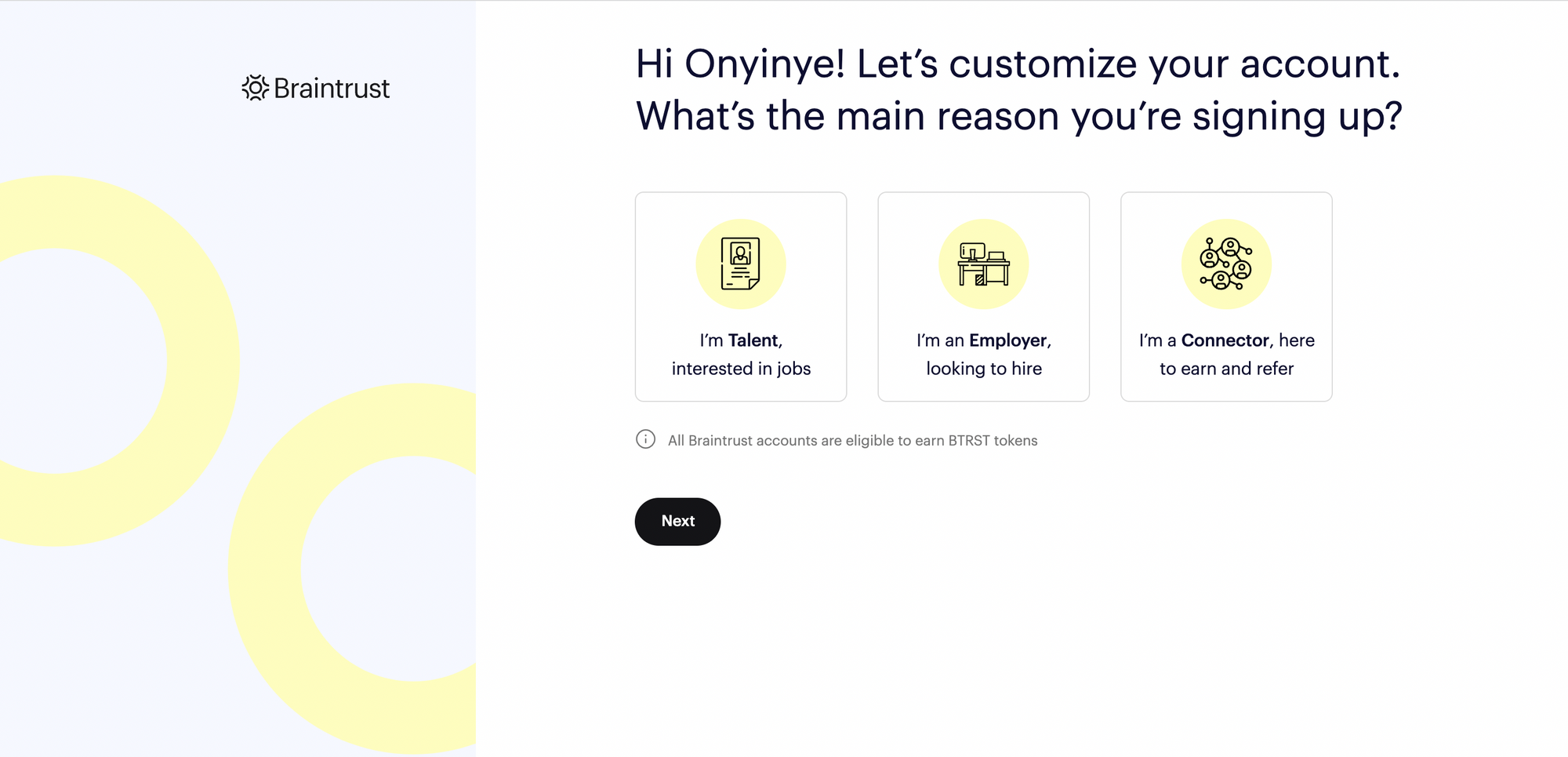
The Braintrust onboarding process gives a first-user the option to customize their account by selecting whether they are "Talent", "Employer" or a "Connector".
In the image above, the onboarding process has been segmented according to the user type and depending on which option the user selects, their onboarding to the platform will be customized accordingly. Only the information needed for each customer type will be required at every point of a tailored onboarding journey and users do not need to be overwhelmed with too many steps to get started.
Using Visual Aids to Highlight Key Features
Visual aids in the form of tooltips or short demo videos are a great way to orient and provide visual assistance to users being onboarded for the first time or even to highlight new features to existing users. Visual aids help the users learn more about your product by themselves and it's been proven that visual aids are often a better learning tool than written instructions.
It is important to remember to allow the user to skip this option but also be able to access the guides when they might need them.
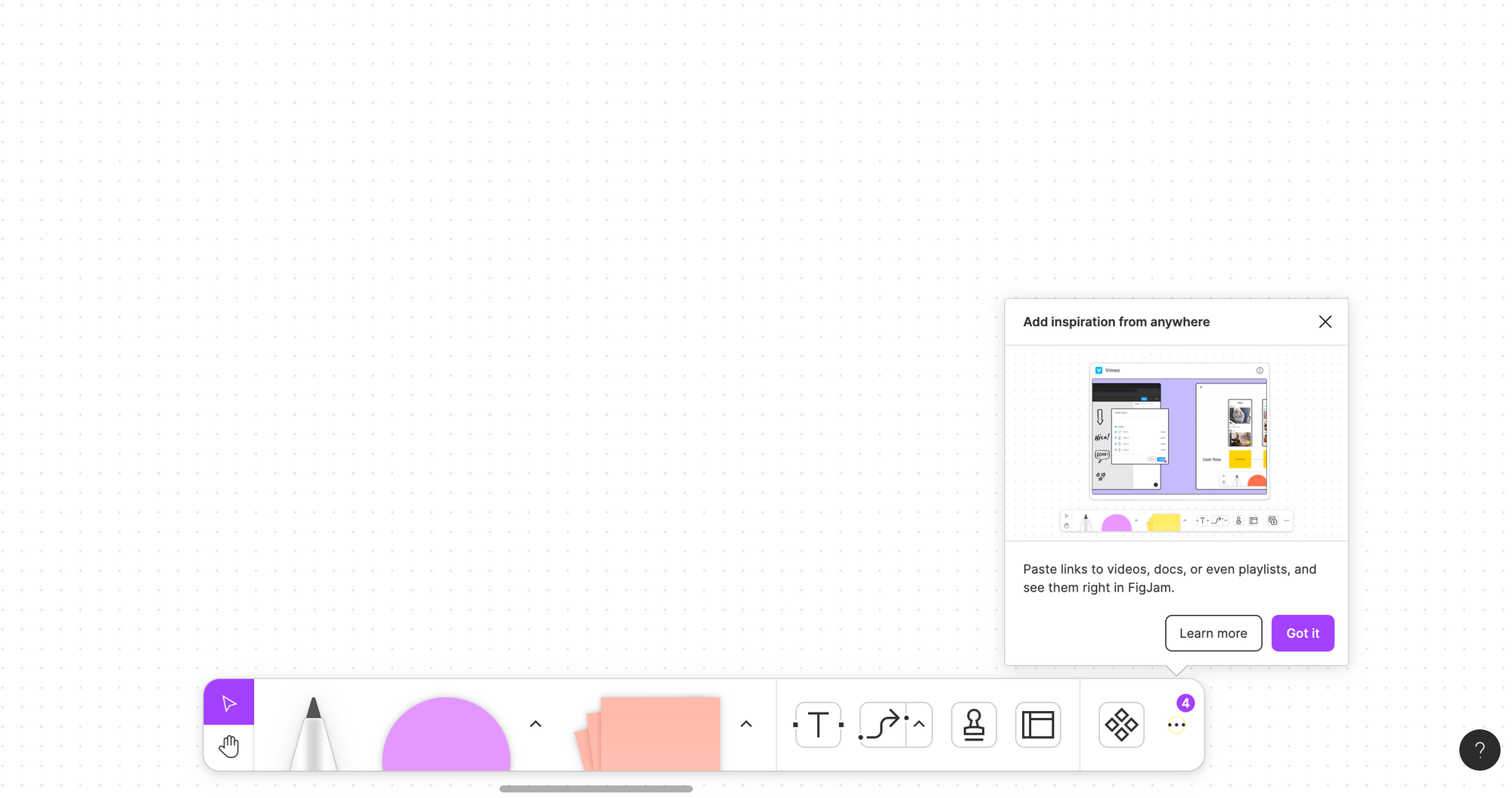
Figma's Figjam offers in-product video tutorials of new features so you don't miss out on any newly added value.
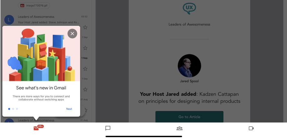
Google's Gmail also makes use of tooltips with illustrations to highlight new features. As shown, the tooltips are used to draw attention to the features of the dashboard that will help the user achieve value much faster.
Minimizing Data Collection
Everybody hates long forms. The kind that starts out asking for actual useful information such as your name and contact details and 200 weeks later, you find yourself still filling out the form with details such as the age of your neighbor's pet fish. This typically has led to a lot of drop-offs in the signup process and certainly, you do not want that.
Reduce the cognitive load on users by ensuring that only absolutely important information is collected from users and that this information is not requested again further along the process. Any other additional information required from the user can always be requested in the future as necessary.
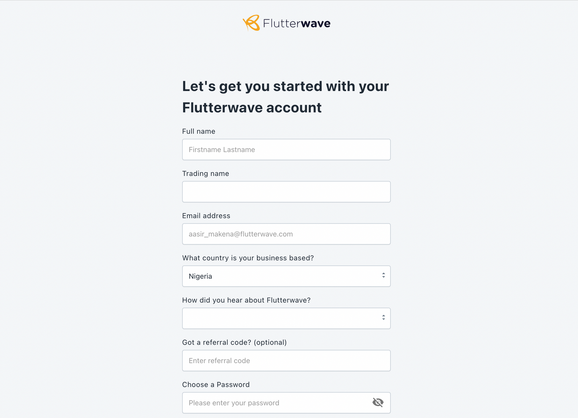
The Flutterwave for Business dashboard requests only important information relating to you and your business to get started.
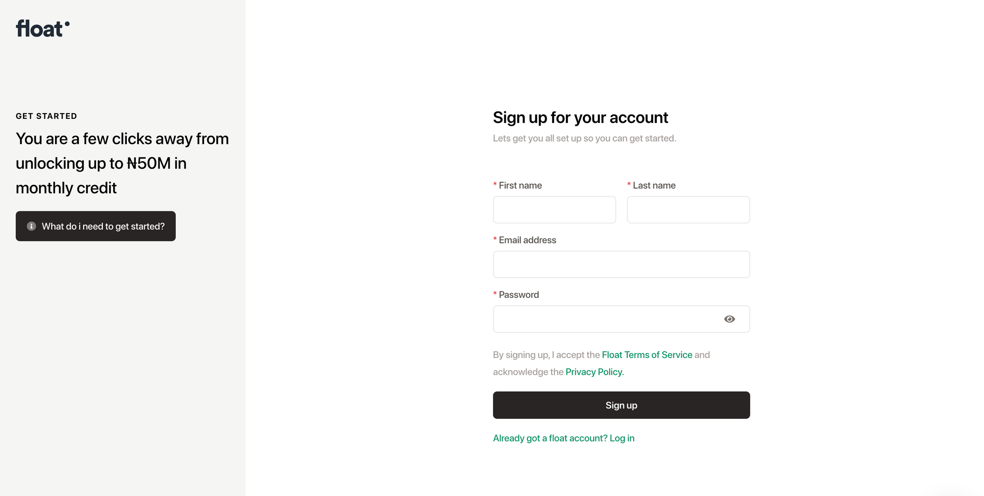
Float Africa also requests only crucial information to get the ball rolling.
Using Progress Indicators
Providing information on the exact point the user is in the onboarding journey, how many steps have been taken, and how many steps are left is a great way to inspire the users to complete the onboarding and also have an estimate on how much time it'll take them to complete their onboarding and actually get to use the product.
Progress indicators could be in the form of fractions (e.g Step 1 of 4), checklists, dots, dashes, ETC - depending on UI preferences and needs.

Dropbox uses a checklist to motivate users to complete the onboarding process.
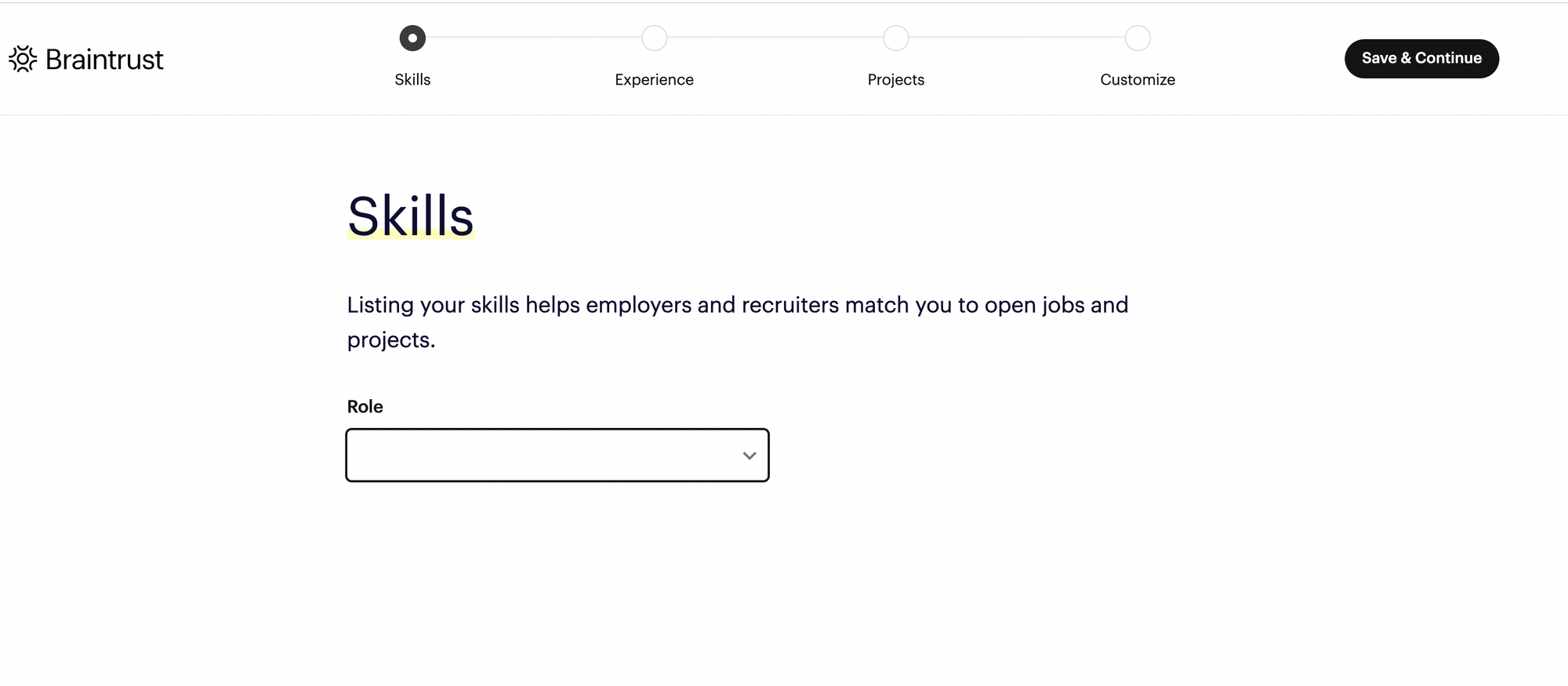
Braintrust uses a progress bar to show onboarding progress. A great example can be shown here where Dropbox and Braintrust have incorporated a way to give feedback to the user on their onboarding progress. This is a proven persuasive design technique to motivate users to finish what they've started.
Easily Accessible Support for Further Help
Sometimes, no matter how much effort you may have put into simplifying your onboarding process, you find that there might be some gaps, and to make sure no user is left out of all the value your product offers, there should be a way to seek additional support.
An active and responsive support portal sends users a signal that they're not alone and you're available to prioritize their needs and offer solutions. This is a great way to improve the user experience.
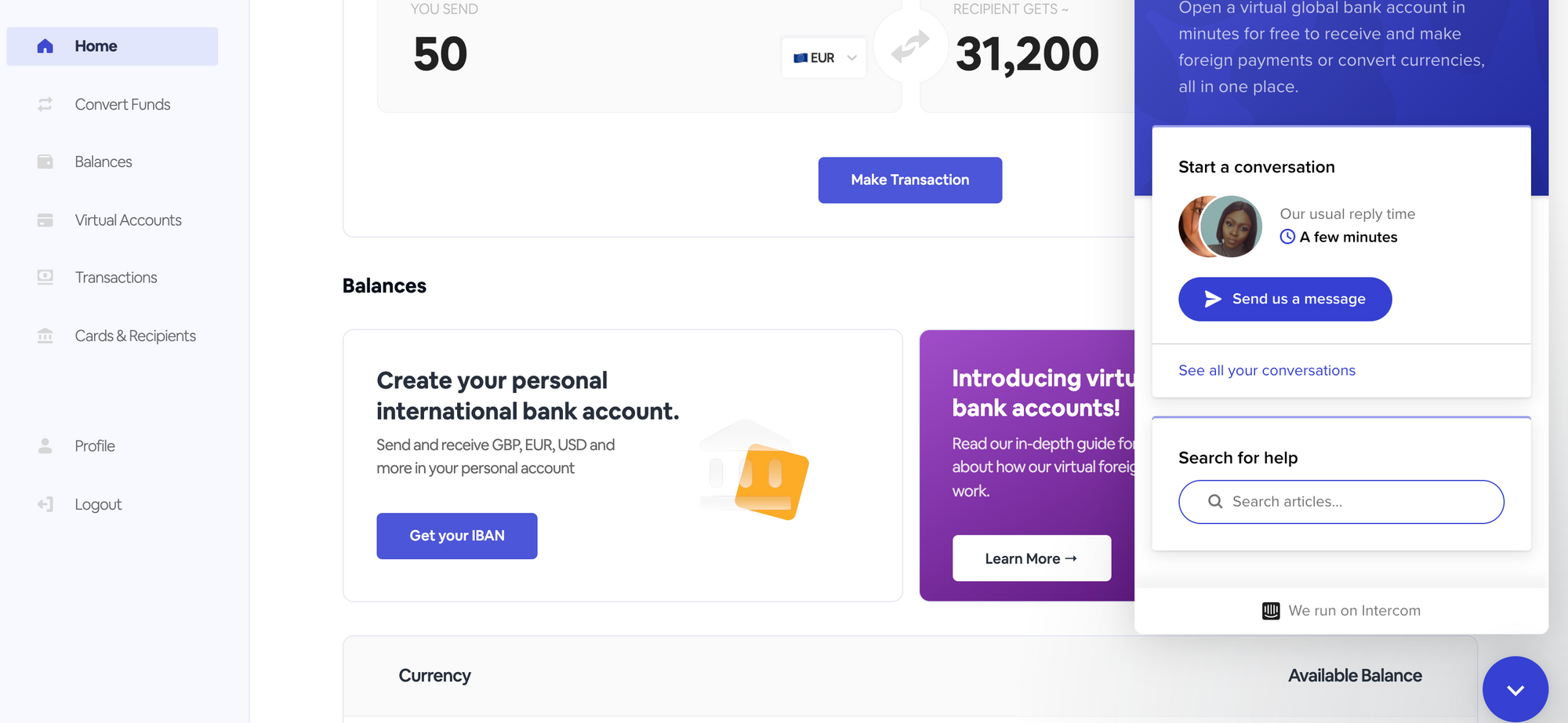
Aboki Africa offers an in-app floating support modal to provide assistance to users.
Conclusion
In conclusion, the main goal of the onboarding journey is to introduce the users to your product and give snippets of the value your product brings and a successfully simplified and engaging onboarding process will help to create a good first impression of your product/brand, build an ongoing relationship with your users and ultimately make it easier for them to use your product. It is also important to remember that creating a seamless onboarding journey is not a one-off process in the product development cycle but one that needs to be tested and iterated to ensure that it provides value and leads to significant user retention.

