What?
UX KPIs (Key Performance Indicators) are a way to quantitatively measure the progress and quality of an update to your product. Let’s say you’ve just added a new feature or you launched a new product and you want to progressively measure success as we know that UX design can make or break a product.
UX KPIs can be used as a way to stay on track and keep a strong focus on product and organisation goals as they essentially help to find the ROI(Return On Investment) of all of the weeks or months of design effort.
Broadly, UX KPIs can be classified into two:
Behavioural UX KPIs - these are metrics that give a representation of user behaviour toward your product and how they interact with it.
Attitudinal UX KPIs - these are metrics that give a representation of how users feel about your product and its user experience in general.
Why?
Measure design success over time
Document product success
Identify areas for product usability improvement
Effectively communicate design value to stakeholders
How?
UX KPIs can act as a guide to determine important insight regarding product efficiency, customer satisfaction, product reliability, and many other determining metrics. Some common ones are:
Net Promoter Score (NPS)
This is a way to measure user satisfaction and by extension customer loyalty by asking customers the likelihood of them recommending your product to other people using a 1-10 rating scale. While the Net Promoter Score is an important UX metric, it is non-diagnostic and as such cannot give specific details but can provide general insight into how customers feel about your product.
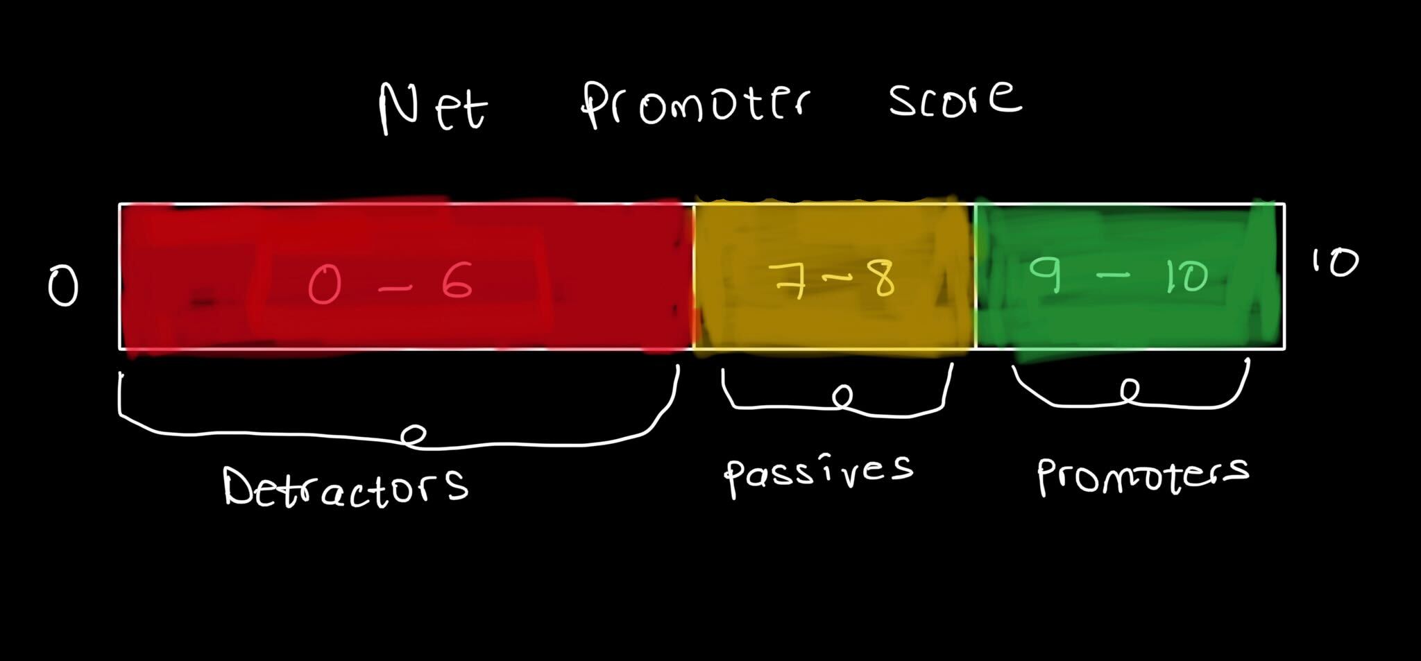
In order to calculate the NPS, the % of detractors (customers who give a rating of 6 or lower) is subtracted from the % of promoters (customers who give a rating of 9 or 10) and the result is used to work on user retention strategy, identify prospects for business growth, reducing churn and improve the overall customer experience.

Sketch depicting the categories of customer ratings used to calculate the NPS
Time of task completion
While this can also be a way to measure the efficiency of a product, it refers to the amount of time taken by a user to complete a given task and seeks to reduce the time by improving the user experience so the user can reach their goals quicker and much easier.
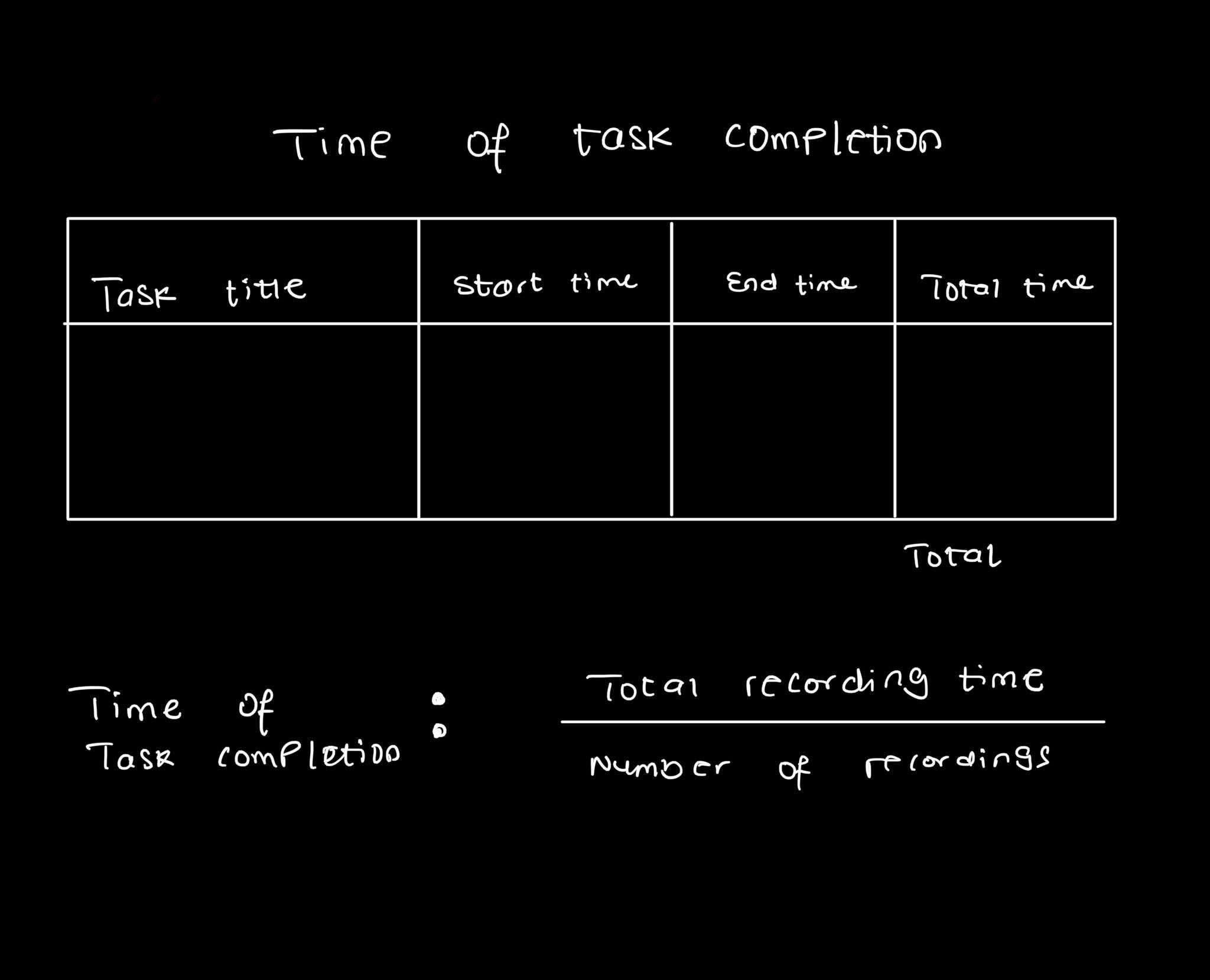
To record the time of task completion, the start time for a task is subtracted from the end time to get the task time. Shorter task times can be an easy pointer to ease of use and good usability.

Sketch of a task completion documentation table
Error rates
This diagnostic metric involves recording the number of errors made by participants when completing a given task. The rate of occurrence of these errors can provide some insight into the ease of use of a product.
In order to document the error rates of a product, a severity rating and a description of the error are used and this can provide meaningful insight into specific problem areas.
Conversion rates
The conversion rate of a product is the percentage of users out of the total users of your product who complete the desired action. Conversion rates can be influenced by a number of factors:
Usability of design
Clarity of content
CTA positioning and clarity
In order to boost conversion rates, efforts must be made to improve product usability by conducting A/B tests to determine which content, CTA, colour, or even buttons convert the most users.
Drop-off rates
The opposite of Conversion rates, also known as Churn, refers to the percentage of users who abandon the product for whatever reason. This is usually an indication that something may be wrong somewhere.
Proper data analysis provides us with insights into drop-off rates and what parts of the product are responsible for the drop-offs. With this diagnostic insight, UX audits and product-specific fixes around problem areas can lead to a reduction in drop-off rates.
System Usability Scale (SUS)
The SUS is a non-diagnostic, simple 10-question scale created in 1986 by John Brooke that helps to evaluate the usability of designs, more specifically the ease of use of a product. The System Usability Scale helps you find data relating to:
Effectiveness - are users able to achieve their objectives?
Efficiency - how much effort is required to achieve these objectives?
Satisfaction - how satisfactory was the experience?
Implementing the SUS as a UX metric is usually in the form of a questionnaire with 5 response options, given to users in a usability testing session with questions designed to get quick and reliable feedback on the usability of a product or feature.

Sketch depicting the question and response model of the SUS
In the end, what KPIs you choose to track are solely up to you and what metrics you intend to document and would find helpful for your product. Each individual KPI gives data on a specific aspect of the product, therefore in order to get a holistic evaluation, it is recommended to implement a combination of two or more of these UX tools for the best insights and actionable data.

