Remember that opening scene in The Matrix Revolutions when Neo was stuck in the train station, in limbo, between the Matrix and the Machine City? Granted, you either haven't seen the film or you'd already grown weary of the franchise by the second installment to bother with the third. However, the scene depicts how Neo, having amassed all the powers required to bend the elements to his will prior, couldn't find a way to get out of Limbo. As it turns out, only the Trainman can get you out. He tried to force his way onto the train at some point, only to learn, rather humbly, that the rule was set in stone, one beyond the heft of his shiny new powers.
As a product writer or content designer, it's useful to think of your job as similar to the Trainman's. You write words to help users get to the places they need to go with ease. There'll be some users who are unfamiliar with the product environment, and those who have a different perception of what they are supposed to be able to do on the Product. Such users will hit multiple roadblocks in their journeys, with nothing other than error messages to guide them out of limbo and frustration. Good error messages are like signposts that pop up when users lose their way.
Error message writing, as an art form, is an exercise in empathy. You have to be able to empathise with the user, anticipate and understand their challenges, to be able to craft meaningful messages that empower the user to make the right call.
"Good error messages are like signposts that pop up when users lose their way.”
There are three traits that make for meaningful error messages:
Contextual

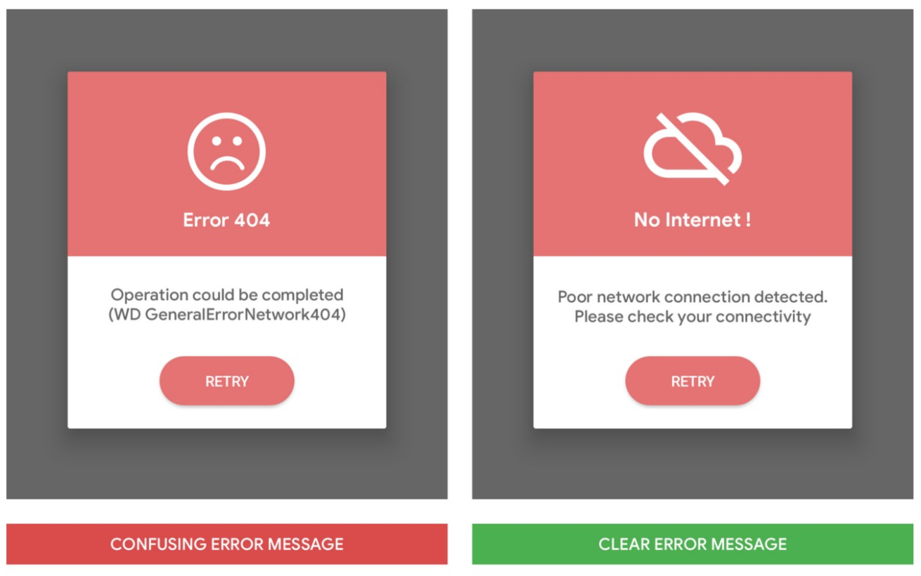
A contextual error message is one devoid of ambiguity or confusion. The message conveys every necessary information required for the user to both understand the reason they got stuck in the first place and be able to take the right action.
Concise

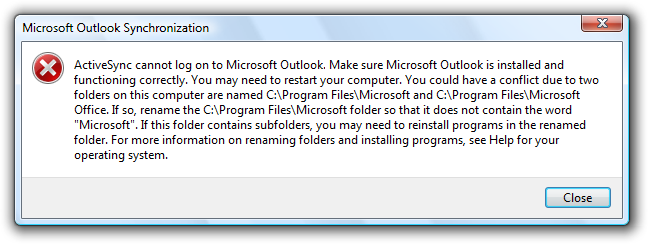
It's useful to understand that the user didn't come to the product to read fine prose. They need help to quickly complete the task that made them launch the app or visit the site (pay for something, upload a file, fill a form, etc). A concise error message will contain just as many words required to offer full context to the user and not a word more. Write for context, edit for brevity.
The real estate for errors in most UIs is small by design, to encourage brevity. Use it thoughtfully.
Empathetic

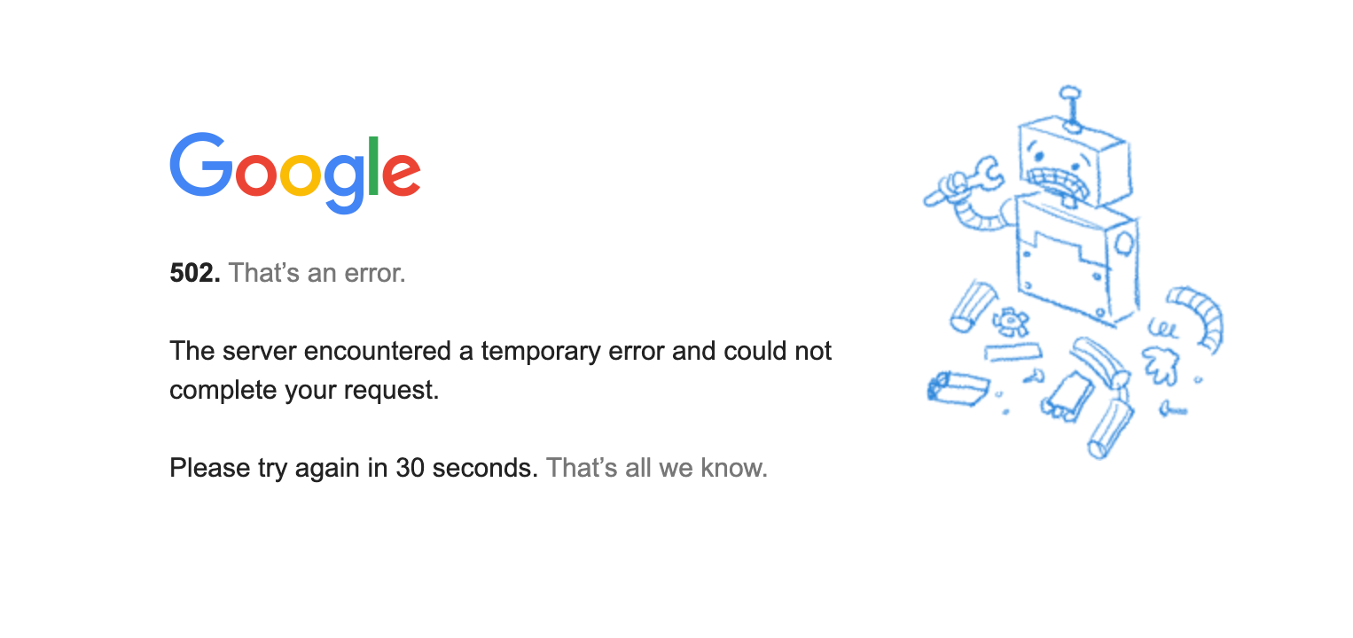
Error messages have to pass the empathy test. Does it show that you get the user's frustration? Is the tone kind or dismissive? You have to assume that the user is unfamiliar with the product, because if they knew better they wouldn't be stuck. Then there's the case when the problem isn't the user, when the product does what it shouldn't do. The user's frustration doesn't disappear just because they're aware they're not at fault; they still can't get to what they are trying to do on the product. Your error message has to be clear, contextual ("Sorry, it's not you, it's us," in this case), and empowering (how to move forward / when we will have solved it). Algorithms are rigid beasts in how they operate. They follow a defined set of rules, and will disavow any contextual command that is outside the defined parameters of their operation. Many users, especially new ones, will be unfamiliar with the context, or there may be a glitch in the system that makes it impossible for the system to do what it was designed to do. In either case, the user is stuck and can't complete a particular action. Like the Trainman in The Matrix, only a meaningful error message can take them out of limbo.
Your work as a UX writer is to convey meaning and information, with as few words as necessary, to empowers the user to take the right actions on whatever product or interface you're working with. And you have to be guided by the three traits discussed above as you go about it.

